Tuesday, 13 December 2011

Paint swatches

 These images show that the swatches don't have to be the standard size that I imagine them to be, long and thin, but I would prefer this so that it is obvious to the audience what they are supposed to be.
 I really like this image below I want to experiment and see what I can do with the idea of the colour swatch.
Ways of fastening- For my swatch recipe booklets I am going to have to faten them somehow. These seem to be fastened in different ways. I prefer the firt one which seems like some kind of pin. I was thinking of using a split pin but would prefer if it wasn't gold. 


Saturday, 10 December 2011

Layout

Homework


 I like this having the images inside the images, it is done a lot but this works well because the images are of people.
 I like this because of the different opacity of the type, I think this will work well in our magazine to represent the magic concept.


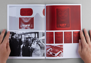
 I really like these duotone images I want to use a style like this in our magazine, I think it will keep it consistent and will make the magazine recognisable.

Friday, 9 December 2011

Creative layout

 We want to use creative layouts for our publiation to represent magic. We don't want to use just standard two or three coloumn on every page. I like the image above with the tyee vertical rather than horizontal it just c


Supermarket signage

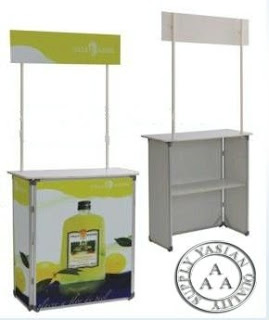
I'd like to propose some kind of sample station for in the supermarket where people can try the new flavours. The design couldbe on a stand like this.

 Aisle signage could be appropriate I couldapply my posters to aisles where the sauces and salad cream to emphasise that the campaign is in existent.