Homework
I like this having the images inside the images, it is done a lot but this works well because the images are of people.
I like this because of the different opacity of the type, I think this will work well in our magazine to represent the magic concept.
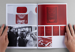
I really like these duotone images I want to use a style like this in our magazine, I think it will keep it consistent and will make the magazine recognisable.


No comments:
Post a Comment