We looked at Stack because it is a branding which works so well because of how simplistic it is, stacking the letters of the word and imagery represents what it is.
Using type only in the format that it's used is so basic but stylish with the choice of colours as well it looks crisp and clean across the products. We want to create some kind of tag line which can work like this across our campaign. We need to come up with something that makes paper appealing and interesting as well as creative and diverse.
Friday, 4 March 2011
Thursday, 3 March 2011
HP Printer ad
I thought this ad was appropriate and relevant to our project because it's using a medium other the print to promote printers but does it in a really clever way, I like how it has a message 'invent' I think this is something we need to have in our marketing campaign, some kind of strap line which will hopefully affect people and leave an impression about the paper range. I would love to use some kind of digital/moving image piece to work along side any print work we produce.
Fedrigoni
Since 1264
"The history of our business dates almost as far back as the history of paper in Europe itself. Over the years, we’ve consistently been at the forefront of our industry, pioneering the techniques and processes that make paper the beautiful, versatile medium it is. It’s a tradition of sustained growth and innovation we’re proud to continue to this day. Building on the past. Delivering the future."
About Fedrigoni
Since its foundation in 1888, Fedrigoni has specialised in fine paper for printing, editing, labels, bookbinding, packaging and paper products. While this remains very much at the heart of the business, the company continually creates new paper processes and technologies that satisfy the ever-changing aesthetic and technical demands of the market. Thanks to an advanced logistics system benefiting from 11 warehouse branches in Italy and seven abroad, Fedrigoni builds strong relationships with customers and provides them with highly tailored services, with very fast turnaround times. By collaborating closely with customers, Fedrigoni creates specially customised paper products along with the 2,500 standard items that are always in stock.
Products:
- Marked paper
- Parchment and transparent paper
- Ecological and recycled paper
- High-density paper
- Cast-coated high-gloss paper
- Pearlescent paper
- Embossed paper
- Laid and watermarked paper
- Paper for digital toner, laser and inkjet printers
- Wood-free offset paper in white and ivory
- Machine-coated glossy paper
- Pulp-coloured paper
Paper uses
Print Finishes:
Fedregoni Splendorlux Black Glossy 240gsm
Century Premium White 100gsm
Litho'd Offset black
Foil Stamp
Die Cuts
Deboss
Bowers & Wilkins at Goodwood 2010
Category - Brochure
Creative: Thomas Manss & Company
Client: Bowers & Wilkins
Printer: Kingsbury Press Doncaster
Papers: -
Cover: Imitlin Verde Edera E55 Aida 125gsm
Text: Symbol Tatami 135gsm
End Paper: Woodstock Blu Intenso 140gsm
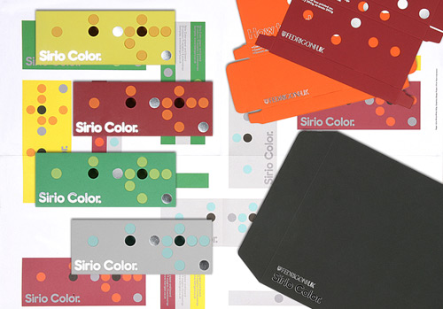
Sirio Color Promotion 2010
Category - Marketing Material
Creative: Design Project
Client: Fedigoni UK
Printer: Team Impression
Papers:
Sirio Color White/White 135gsm Poster,
Sirio Color Black/Black 290gsm Envelope,
290gsm Sirio Color Boxes:
Cherry & Arancio (Red & Orange)
Verde & Lime (Green & Green)
Perla & Smeraldo (Grey & Blue)
Limone & Gialloro (Yellow & Yellow)
YCN Student Annual 2010/11
Category - Art/Design
Creative: YCN
Client: YCN Ltd
Printer: Rotolito Lombarda, Milan, Italy
Papers:-
Text: Freelife Kendo 120gsm
The Fedrigoni shows a range of paper stocks and finishes etc which shows they stock a versatile range, we need to pick one range which we can work with and experiment with most allowing us to show off the range to its full potential and make some exciting, creative pieces for the submission.
Wednesday, 2 March 2011
Marketing campaings
Clever, interesting existing marketing campaigns:
What I like about these and why I think they work is because they take exising elements and use them as their own, they are creative and daring and they also are all interactive devices which allows customers to tocuh or identify with something they recognise.
What I like and think is effective about these is the context, they are out there in the world in places where thousands of people will attend everyday, they can all realte to these promotions and they are clever becuase a lot use exisiting materials/objects but have altered them to be specific to their product like the luggage conveyer and the bus stop.
Wednesday, 9 February 2011
DVD packaging
I like the idea of taking the design from the packaging and taking it across onto the actual CD so that when it is in the packaging it blends in. I want to use this idea of taking the design across onto the CD so it is consistent.
A lot of these are interactive pieces of packaging in which the audience has to look in or remove something to reveal the actual DVD, this builds suspense and creates an enjoyable experience interacting with the product.
I really like this, it's a pretty simple idea but works so well because of how the CD is the perfect shape to reflect the product that it's supposed to be, salami.
Monday, 7 February 2011
Audio- title sequence
Not British enough, suitable to This Is England because of the Jamaican vibes- fits in with Skinhead culture but not appropriate for a generalisation of Shane Meadow's films.
I think a British song would be best to help represent the fact that I am trying to portray the work of a British film maker. I looked at using the same song from my idents but I don't like the vocals when the song gets past about 15 seconds so I'm looking at this again, I looked at it for my idents but I think the pace fits well and I think it's an appropriate song.
I looked at this because it is quite lively but I don't think the pace is quite fast enough to fit in with my drawings, also Ian Curtis' voice may not be suitable for the tone of my animation.
I looked at this Cure song because of it's fast pace I think it could work really well together with my animation I can only seem to find live versions now though which aren't of good enough quality. For the last 2 or 3 mins of this its all instrumental as well which could work well having no vocals.
Maybe at about 0.45 seconds into this it could be suitable but I think it may be too distracting because of the voice, the lyrics may be suitable describing this 'mad world' but I think it might be too complex to use with my animation.
Subscribe to:
Posts (Atom)